Take the faster path to growth. Get Smith.ai today.
Affordable plans for every budget.


"Learn More" tells a visitor almost nothing. "Get Started" tells them slightly more but commits to nothing specific.
CTA buttons are the last piece of copy a prospect reads before deciding whether to click — and button copy that names the outcome consistently outperforms copy that names the action.
This piece covers four principles behind high-converting CTA buttons, followed by 13 real-world examples that show those principles in action, with specific analysis of what makes each one effective.
Most weak CTAs fail for the same reason: they describe the click rather than the result. These principles separate buttons that convert from buttons that get ignored — and they apply whether the CTA lives on a homepage, pricing page, or mid-article prompt.
The most common CTA mistake is describing what the visitor does rather than what they get. "Submit" tells a prospect they're doing work. "Get your quote" tells them they're receiving something valuable. Outcome-driven copy removes a mental hurdle that generic action verbs create. It also pre-filters intent: "Start my free trial" attracts decision-ready leads that "Learn More" does not.
A visitor on a cold blog post and a visitor on your pricing page are at different stages of readiness. A hard CTA — "Buy now," "Request a demo" — jars someone who hasn't formed intent yet. A soft ask — "Get the guide," "See how it works" — jars someone already evaluating options. Customer experience data shows friction peaks when the ask outpaces the visitor's readiness.
Switching CTA copy from second person to first person is a small change with a measurable effect. "Start your free trial" becomes "Start my free trial." The first-person construction gives the visitor a sense of ownership before clicking — the resource already feels like theirs. For appointment scheduling and booking pages specifically, first-person CTAs reduce the psychological distance between intent and action.
Specificity outperforms personality in button copy. "Book in 90 seconds" converts better than "Book now" because it addresses the prospect's hesitation directly. "Get your free card reader" converts better than "Sign up" because it names what the visitor receives. For purchase CTAs where payment collection is the end goal, naming the offer — not the action — reduces abandonment before the transaction.
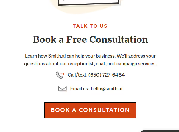
With this CTA, we’re telling our audience specifically what to do: reach out to us to schedule a consultation at a time that works for them. They can do this by clicking the CTA button or by using the contact information above the button to reach us. It’s one of our most effective CTAs and it’s a great way to start the list.
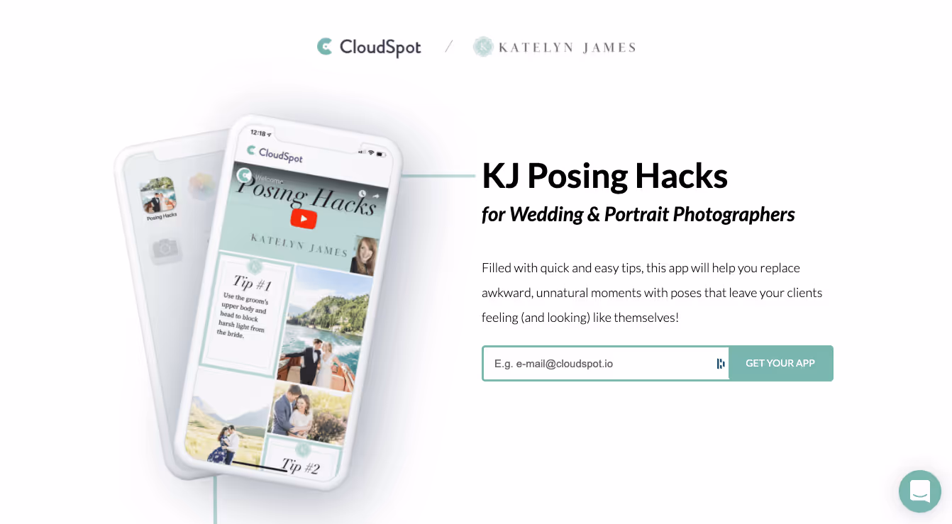
This one puts it in the users' hands: get YOUR app, not “our” app. It’s a great way to hand the responsibility and ownership to the user and increase the likelihood of conversion.
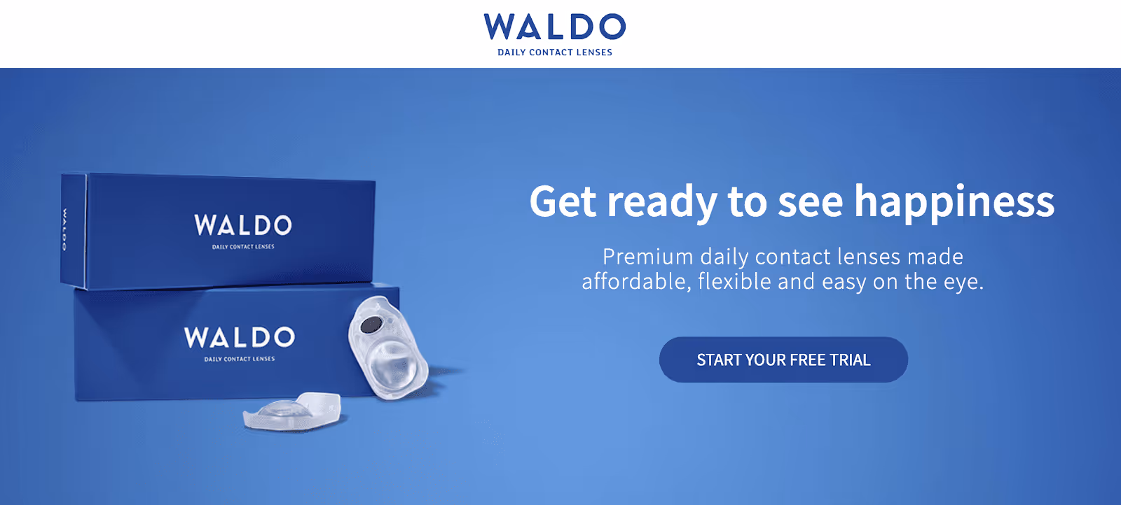
This one gives you two great lines. The CTA is clear as day: when users click, it will lead them to start their free trial. And why should they do that? The line “get ready to see happiness” sums that part up.
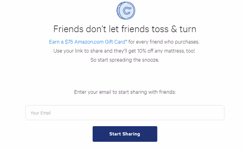
Not only do they have a great message with “friends don’t let friends toss & turn,” but they also have a simple, straightforward signup that tells you exactly what to do. It’s direct and simple.
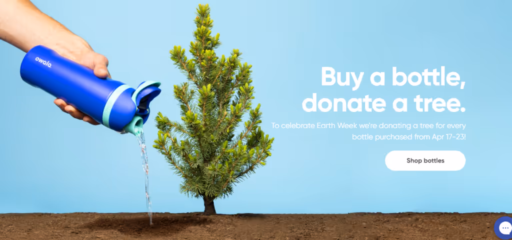
This one is again direct and concise. Once people read what the cause is, they can simply click the CTA rather than having to navigate to the sales page on their own.
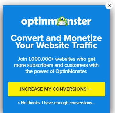
Here’s another example of turning the ownership around—the button says MY conversions, not “your”—this often creates a connection for users they can’t deny, resulting in the click-through.

It stands out and it makes a simple statement. Again, it tells the user exactly what to do: start their trial.
What better way to be upfront than to go straight to the pricing page? Most consumers will tell you that they LOVE it when brands are transparent and confident in what they offer, as opposed to those brands that want to provide “custom quotes” or ask you to contact them for pricing.
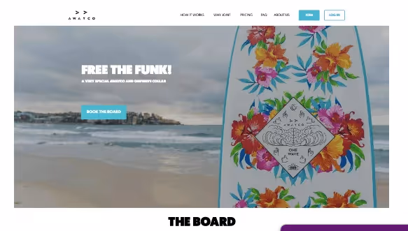
This board rental company is a great example of keeping it fun and getting to the point. Their CTA is direct and tells the user exactly what they’re getting.
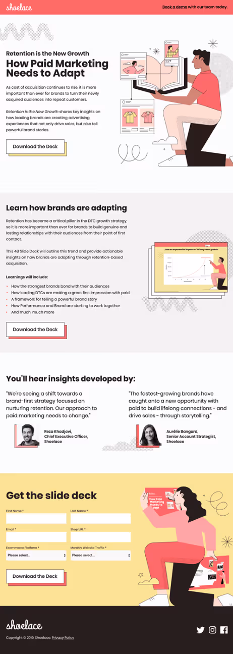
This is a great example of using the same CTA in multiple places to make a simple, repeated point: get the deck.
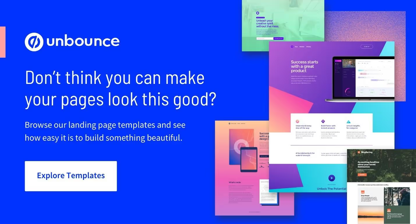
This bright, eye-catching design also tells you exactly how to proceed: Explore the templates to create better landing pages.

Goby keeps it simple, starting by advertising a good deal and then inviting users to “get your Goby” with a simple CTA.
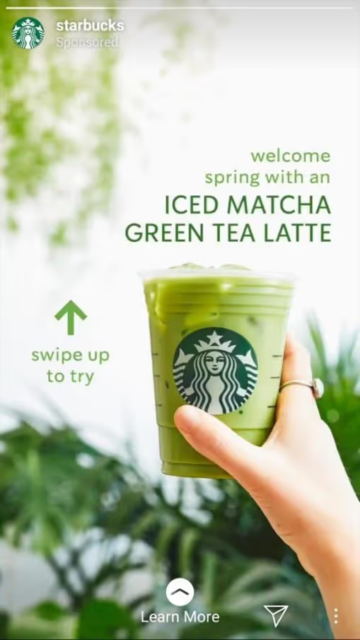
This is a cool example of Instagram Stories used for marketing. It’s innovative and it creates curiosity, which is the key to getting people to click—if nothing else, people want to know what’s on the other side.
The only way to know whether a change in button copy actually improves performance is to test it against a control and measure the result over a meaningful sample. Most CTA testing fails not because the copy was wrong, but because the test itself was structured poorly.
These three practices determine whether the process produces reliable, actionable data or just noise.
A/B testing CTA copy means running two button versions against the same audience simultaneously to measure which drives more clicks. The constraint: change one element per test. Swapping copy, color, and placement at the same time makes it impossible to know what drove the result. Start with the words, measure over a statistically meaningful sample, and move to the next variable only after a clear winner emerges.
Different CTAs serve different goals, and the metric you optimize for should reflect that. A homepage button optimized purely for CTR may appear to be performing while delivering poor-fit inquiries. Three numbers cover the full picture:
CTA tests require enough traffic to produce reliable results — typically several hundred clicks per variant at minimum. Running tests on low-traffic pages for short windows produces noise, not signal. Prioritize high-traffic pages first — your primary booking or contact page — before testing CTAs on lighter content. An inconclusive result is a signal to extend the test, not declare a winner.
CTA buttons move prospects from awareness to action — and that action only matters if your business is ready to receive it. A "Book a consultation" button that converts is the start of a conversation, not the end of one.
Smith.ai's AI Receptionist and Virtual Receptionist answer every inbound call with professional intake — screening new inquiries, scheduling consultations, and capturing caller details 24/7 so no lead goes unanswered. Book a free consultation to see how both serve your business.
.avif)
Sean Lund-Brown is a current Marketing Assistant for Smith.ai. A graduate from Metropolitan State University of Denver, Sean graduated with a BA in Music and an individualized degree in Teaching Vocal Pedagogy.


