The Psychology Behind Colors and Its Importance for Content Marketers
The Psychology Behind Colors and Its Importance for Content Marketers

Research has shown that humans are visual creatures with a tendency to respond favorably to specific colors. Content marketers must enhance their brand message by choosing the right colors that spark a particular reaction from their target audience.
The key to success is understanding the psychology behind various colors and applying these insights when designing your logo, website, and marketing content.
Let's take a closer look.
What is color psychology?
Color psychology is the study of how humans perceive and process color. In other words, when you see a particular color, your brain reacts to it in a certain way.
Some of this has to do with how we experience colors in nature. The interpretation of colors differs from person to person based on their cultural background and personal experiences.
Thus, marketers have to be smart enough to understand the psychological response to specific colors in their content to convey the right message to a particular audience.
How are colors perceived?
Colors in content marketing can play an essential role by triggering specific emotions and feelings. It's not just about picking colors you like or that match your brand.
Knowing what each color represents is essential to use them effectively in your messaging.
Red

Red is said to trigger powerful emotions, both positive and negative. It creates a sense of urgency and can effectively drive sales.
Red encourages appetite and is frequently used in the fast-food sector to stimulate hunger; think of Chick-fil-A and Arby's.
Red's long wavelength makes it one of the most visible colors in the spectrum. Its ability to instantly grab people's attention is why stop signs, traffic lights, and other warning devices are often red. It also gets your heart racing and is often synonymous with excitement and danger.
People drawn to red tend to be bold, adventurous, and energetic. For example, Tiger Woods wears a red shirt on Sunday, the final day of a golf tournament, to display his bold personality and dominance on the golf course.
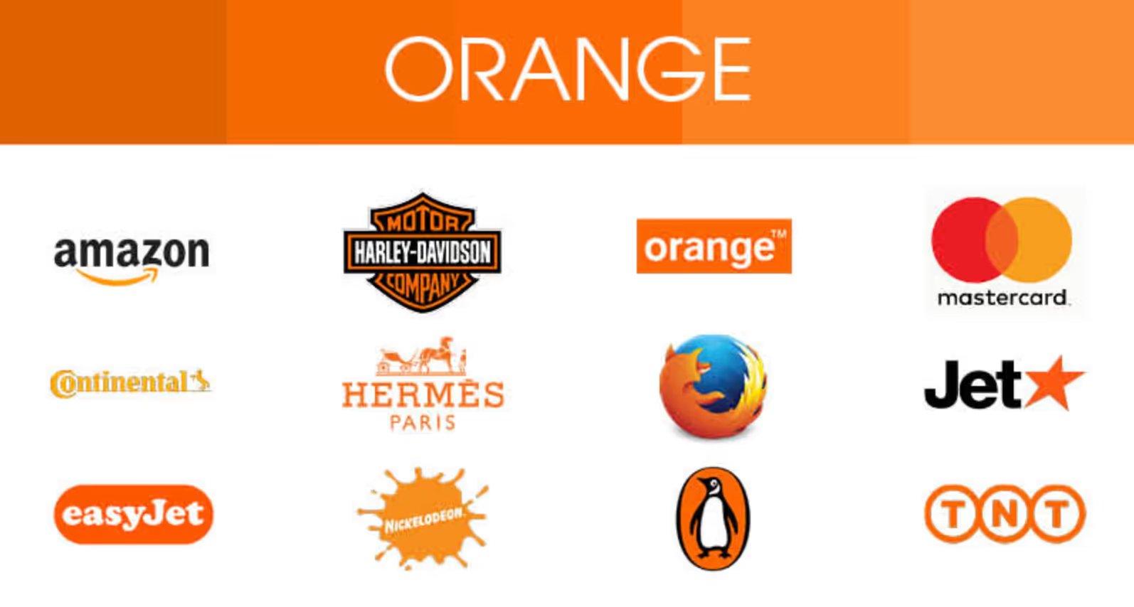
Orange

Orange is a high-energy color. It can make you feel enthusiastic and excited. Because orange is a vibrant color, many sports teams use it in their uniforms, mascots, and branding.
People often see orange as a bright, happy, and cheerful hue. Orange is the color of peaceful sunsets and succulent fruits—oranges and peaches—that remind us of those golden moments.
Orange design elements used in advertising can spark enthusiasm. Consumers most often link the color orange with inexpensive products. However, it is a very attention-grabbing color.
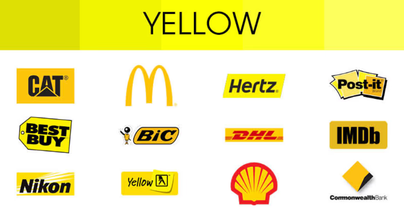
Yellow

According to color psychology, yellow is a positive and energetic hue that can invoke happiness and optimism—think about how the sun makes you feel.
Yellow is also a color that can be associated with health and vitality. It is commonly seen in hospitals as it helps reinforce feelings of strength and well-being.
Even though we associate yellow with positive emotions, it can be overwhelming if you use too much of it. Too much yellow can cause anxiety and nervousness. It's best to use yellow sparingly and in small doses.
Green

When you think of green, what comes to mind? If you said nature, you're in good company.
Green is the color of growth and renewal, and it's often associated with nature and plants.
Green is a popular color among health brands, organic foods, and sustainable energy. Green is a calming color made up of shorter wavelengths that makes it easier on the eyes.
On the flip side, green is also the color of money linked with power or greed. You might have heard the expression "green with envy" used to describe a person who has a strong desire for something that someone else has.
Blue

Blue is the color of stability, calmness, and harmony. Think of a warm sunny day with bright, blue skies or the serenity of raindrops falling against your window in the early afternoon.
Blue is a very dependable color. For that reason, blue is the most commonly used color by brands across various sectors. Blue logos depict the sense that if you need something done right, you can count on me.
Let's take a look at a few examples.
Personal Capital uses blue to generate trust and dependability, one of the main aspects you want when using a financial tool like a net worth calculator.

Reliable Couriers is another excellent example of applying color psychology to appeal to potential clients. This brand leverages the color blue to generate feelings of stability which is everything you want when using a same-day courier service.

Finally, GetSafe, a company offering medical alert systems, utilizes blue in its branding to emulate reliability. Medical alert systems need to be reliable and ready to use when medical attention is required.

As you can see, blue is a prevalent color used by brands alike to show trust and dependability. However, your brand might also blend in with the sea of blue-colored logos.
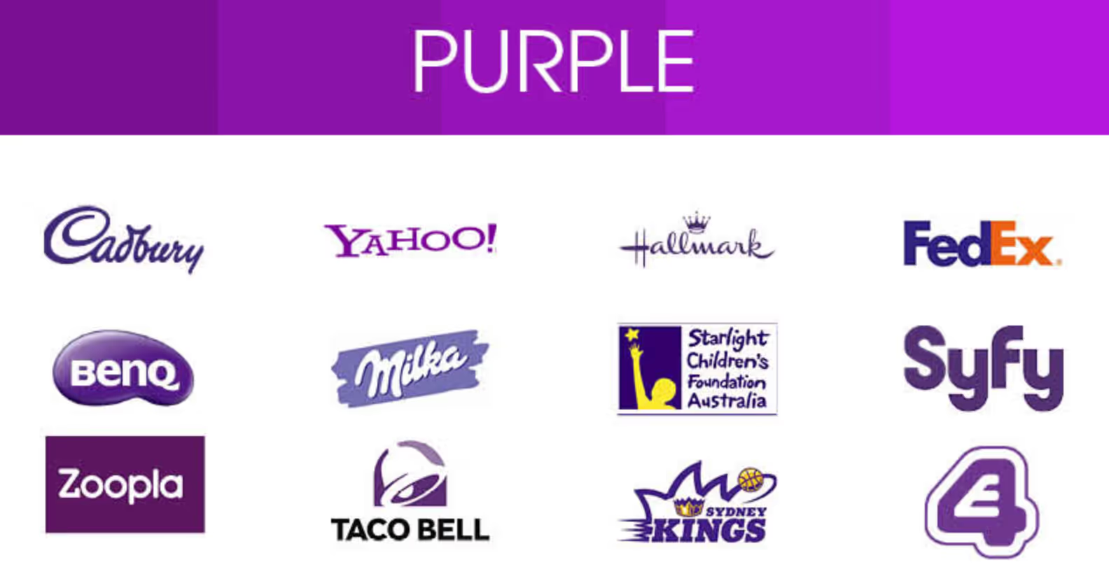
Purple

Purple is the color of royalty and luxury, and it's also a perfect complement to gold. It has a calming effect but also indicates creativity and individuality.
It's no surprise that many of the great creative minds of our time leverage purple in their brands: Prince, Tyra Banks, Marie Antoinette, Barney, Willy Wonka—the list goes on. Maybe it's because purple combines the stability of blue with the energy of red to create something unique.
For example, Stack is a brand trying to create something unique, almost exotic, with its Spatial Browser. The color purple is the perfect choice to align with their brand creativity.

Forward-thinking people usually associate better with these tones, especially in technological aspects.
Black

The color black is one of the most potent and evocative colors at your disposal. It's mysterious, seductive, and elegant.
Black is an absence of light, which means that it holds all of the colors together—it's a reflection of them all. That said, black is the most versatile hue on the spectrum.
Black is associated with elegance and sophistication, so designers often use it for high-end fashion brands and luxury goods. "Classy" is a common word used to describe this shade as sophisticated, formal, or stylish.
Black also has a unifying quality when paired with another intense color like pink or chartreuse.
Black print against a splash of color brings attention to more minor details on web pages, drawing the eye's attention by creating a pop of energy.
Importance of colors for content marketing
Colors have a more significant impact on our lives than we consciously think about daily.
When it comes to content marketing, color is one of the most critical aspects of your brand. It can influence people's emotions and affect their willingness to buy your product or service.
When color is used correctly, especially in marketing materials such as landing pages, it can enhance consumer experiences and improve conversions. Using an online photo editor like Picsart can help you edit visuals and photos to catch your audience's attention.
Color is an integral part of content design because it helps create a sense of brand identity and recognition for unfamiliar readers with your product or service. Having some consistency across online pieces makes it easier for customers to associate with you.
Additionally, color should be a strategic initiative in your content marketing to evoke specific feelings or elicit certain behaviors from your target audience. For example, use bright hues like yellow to encourage action or leverage blue to elicit feelings of trustworthiness or tranquility.
There are many online education resources from sites like StuDocu, where you can learn more about content marketing and how to leverage psychology to draw in potential consumers.
Wrapping up
The reality is that color is one of the most powerful tools in your arsenal when it comes to content marketing — sometimes more powerful than the content you produce.
The correct use of color will ensure that you engage with your target audience and grab their attention, which leads to increased sales and better brand awareness. And the incorrect use of colors can turn your message on its head, making people less likely to engage with your brand.
The main takeaway is that color matters. To ignore it as a tool for content marketing is missing an essential piece of the puzzle.
Take the faster path to growth. Get Smith.ai today.
Key Areas to Explore

Your submission has been received!


.svg)


