35 Best Website Designs to Inspire Your Site Makeover
35 Best Website Designs to Inspire Your Site Makeover

Your website is not just a showcase of your product; it’s a direct display of your ability to present business with professionalism and style. Yes, your customers and partners should leave your site with the information and services they need, but they should also leave with a good impression.
A clean, easy, attractive site suggests that your company does business in the same way and will encourage one-time guests to become faithful regulars. Pulled from businesses across the web, the following are 35 examples of companies that took this idea to heart to create some of the best website designs. Allow these website makeovers to inspire your own.
35. Create a finished theme
Rule number one has to be: don’t launch an unfinished site. It should go without saying, but yet many businesses forget this rule. Eager to get themselves out there, some businesses will launch only half a website — perhaps with a logo and description, but lacking the core functionality that makes the site complete.
One such company, which took “you’ll be perfect when you’re dead” too seriously, is the Alberta, Canada-based restaurant and catering company, Pulcinella. For years, their site sat there, published to the whole world but woefully incomplete.
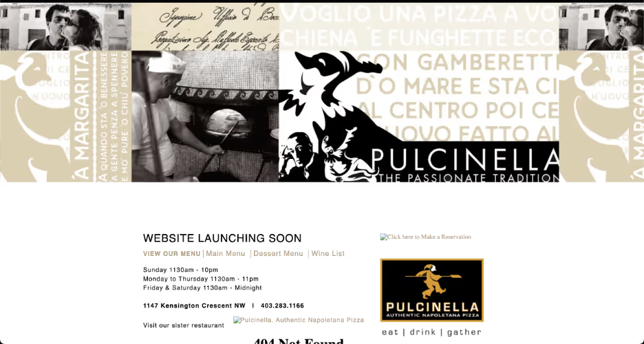
Screenshot from Wayback Machine taken 05/31/2012. Accessed 08/27/2021.
Aside from a banner and logo, the site had little except for broken links, sparse text, and vast swathes of white. Any guests looking to learn more about the restaurant would learn only that it was unprepared for internet usage.
34. A classic vintage concept
By 2013, Pulcinella had completely retooled its website. The site looked finished, and the simple graphics and coherent color scheme fit the company’s vintage theme. It’s worth noting that the website was not yet free from problems, though. It had been created with an awkwardly large side-scrolling landing page that tended to cut off text. Nevertheless, the website gave the appearance of completeness and, most importantly, professionalism.
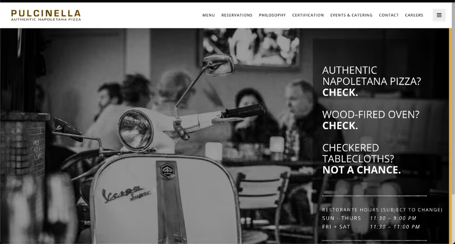
Screenshot taken 08/27/2021.
Viewing their page today in 2021, Pulcinella has ironed out all the kinks. Grainy photos of aged Italian chefs and brick ovens compliment the simple, legible interface and make Pulcinella seem like the authentic, fine-dining experience it claims to be.
33. The symmetry of products and design
Some level of symmetry needs to exist between product and site. A good website reflects on its parent company and the goods and services it advertises and sells. For example, a business selling art supplies may benefit from brighter colors or nicely contrasting dark tones. One selling camping supplies, however, may lean more towards the earth tones suggestive of nature.
For a company like Bath Magic, which restores and re-beautifies bathrooms, a certain sense of neutral simplicity and elegance is necessary. In 2013, the Bath Magic website did not have either. Instead, the garish site alternated between offensively bright primary colors and painfully basic chunks of too-small text. Its logos were pixelated and cartoonish. Overall, the site did not suggest beauty or elegance in the least.
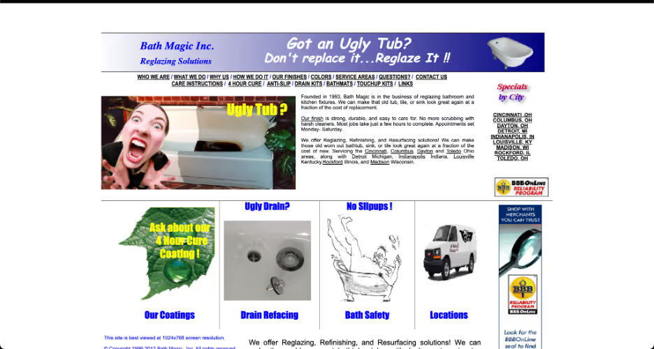
Screenshot from Wayback Machine taken 05/30/2012. Accessed 08/27/2021.
32. Using design to highlight information
A visit to the Bath Magic page today is the exact opposite experience. The page is sleek, shiny, and built from a complementary palette of cool tones, just like the ideal bathroom.
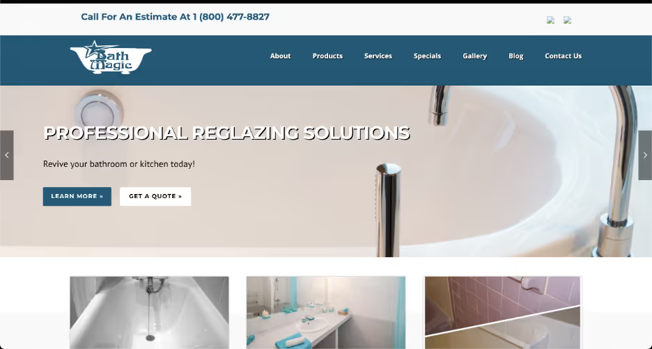
Screenshot taken 08/27/2021.
Visitors to the site no longer have to question the design talent of its creators. Instead, they are likely to leave with not only the information they sought but also the impression that Bath Magic is a company that understands taste and composition.
31. A professional palette
Like Bath Magic, Mimarch is a company that offers its customers aesthetic insight and remodeling. Instead of bathrooms, however, Mimarch focuses explicitly on design in architecture, engineering, and, most importantly, graphic design. We mentioned that a website reflects on its products, but for a company that specifically offers graphic design, the website instead becomes an audition.
In 2012, Mimarch’s website was a failing audition. Its cluttered, clashing layout and palette would look unprofessional for the average business — for a design firm, it was especially heinous. A low-resolution cartoon of a building complex was covered in too many buttons and not nearly translucent enough. An entirely separate set of buttons offset the first, completely opaque and separate for unknown reasons.
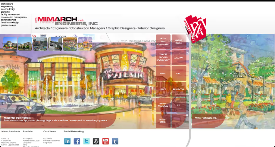
Screenshot from Wayback Machine taken 11/03/2012. Accessed 08/27/2021.
30. Color-coordinating clarity
Mimarch, now rebranded as Mimar, has a website today that displays the sleekness, shapeliness, and forward-planning expected of a design firm. Scrolling down, its various services appear one at a time, all have their own banner, and they are organized by increasingly offset, color-coordinated tab headings.
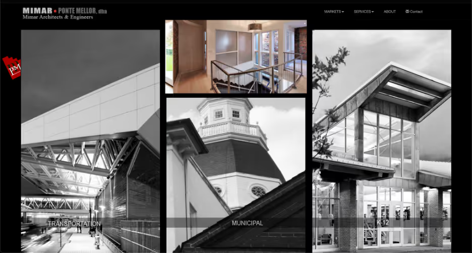
Screenshot taken 08/27/2021.
It is a pretty design, and crucially, it is uncluttered. Despite Mimar’s numerous different specialties, all are easily located, distinguished, and accessed. The move from a crowded homepage to a semi-infinite scrolling style cleaned up Mimar’s page well.
29. Finding a pulse: keep your website up-to-date
Websites have to stay up to date. Sites must be regularly updated because every year that they are not, your company will look more and more out of touch. Even worse, your site could begin to give the impression that you are no longer open at all.
That was precisely the problem with the website for Utah Ski Rentals, whose bright primary colors, heavily aliased text, and clip-art graphics made it look like a 1995 GeoCities site. The problem was that the site, in that archaic incarnation, lasted until 2011. Visiting that site in 2011, anyone would assume the company had long since gone under.
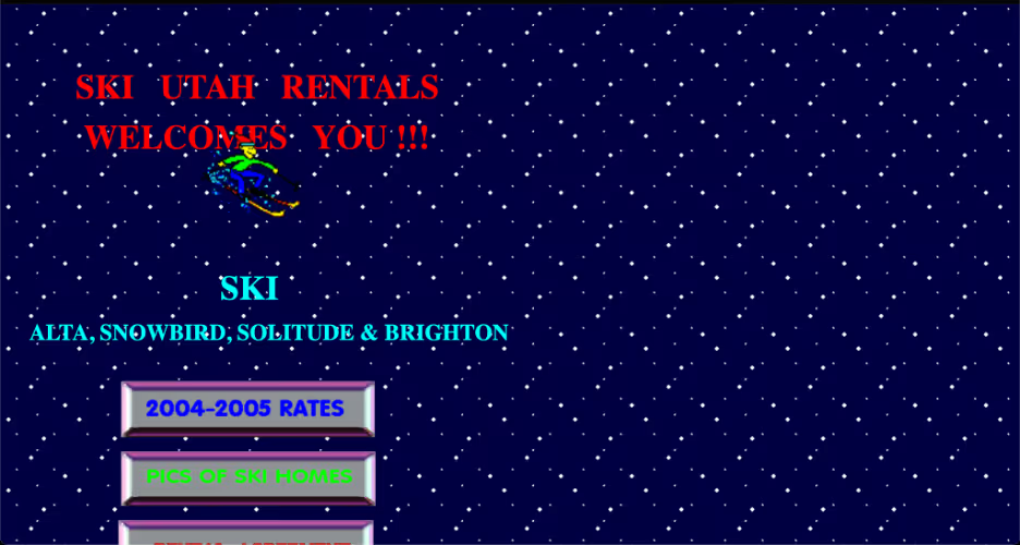
Screenshot from Wayback Machine taken 10/05/2010. Accessed 08/27/2021.
28. Planting an evergreen site
Happily, Utah Ski Rentals updated their site. It is by no means a perfect site now; its glaringly empty white zones and tiny text leave much to be desired. Still, despite its faults, it gives the clear impression of being modern. Looking at the site now, anyone would assume it is still functional, along with the company that runs it.
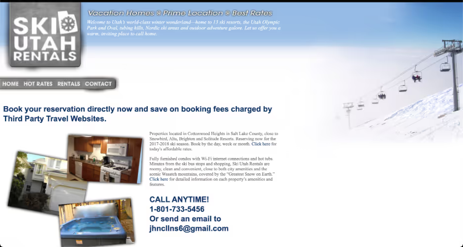
Screenshot taken 08/27/2021.
It’s necessary to keep in mind that this is an ongoing process. The upgrade to Utah Ski Rentals’ site was a tremendous improvement, but it is not evergreen. In five or ten years, it will likely look just as dated as its predecessor, which is why you should always aim to keep up with advances in technology and taste.
27. Saturation is overrated
The Utah Ski Rentals site also demonstrates a basic but important concept: brighter is not always better. The 2010 site used the ultra-saturated primary colors common to text in ‘90s websites, presumably designed to grab attention and stand out from competitors.
However, recent trends in web design have shown that brighter text does not grab more attention — and in fact, quite often deflects it. As important as it is to grab attention, turning text into a kaleidoscope may not be the best way to do it.
The new Utah Ski Rentals site is simple and muted. Its entire color palette is essentially three unsaturated colors, and it looks great because of it. Navy blue, gray, and white offer plenty of contrast and clarity without the visually-induced migraine of the old site.
26. Plan the user experience
When it comes to web design, less is very often more. Ultimately, sites are designed to get the desired content and experience to the visitor in the easiest way possible. The more text, colors, shapes, sounds, and videos a visitor has to push through, the longer it will take to locate what they need from you, and the less likely they’ll find what they need at all.
Mortimer Lumber is a small chain of hardware stores whose 2013 website forgot that less could be more. The site crammed as much content as possible onto its landing page, stacking it all in rows and columns of boxes that each contain pictures, text, and drop-down menus. It gave the impression of one large, crowded Excel spreadsheet.
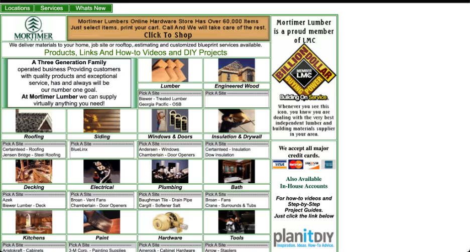
Screenshot from Wayback Machine taken 07/22/2013. Accessed 08/27/2021.
25. On-page content reflects the sales funnel
The Mortimer Lumber site today is a vast improvement. Utilizing the basic principles of information architecture and visual hierarchy, it traded in its all-at-once spreadsheet-style home page for a more accessible and intuitive pyramid structure of content. The landing page is dominated by a large upper logo, underlined by a smaller, straightforward menu that gives each type of product its own page.
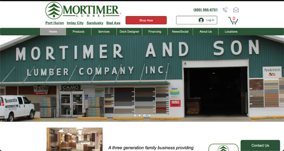
Screenshot taken 08/27/2021.
Going from more basic information (like the company name) to more specific information (like product descriptions) means increasingly more basic font and design and increasingly less emphasis. It is a natural way to convey content and create sales.
24. Create a hierarchy
It is important to understand that every rule in web design has its limit. “Less is more” is a great mantra to repeat when assembling an interface and its contents, but when taken too far, a website becomes useless.
A great example is the 2012 website of the Leoneck Hotel, which was so minimal that it almost seemed unfinished. Indeed, were anyone to glance at the site — a small piece of clip art and two links amidst a sea of white — they might reasonably assume that they’d found the wrong page, the business had gone under, or that the website was a personal one with a coincidental name.
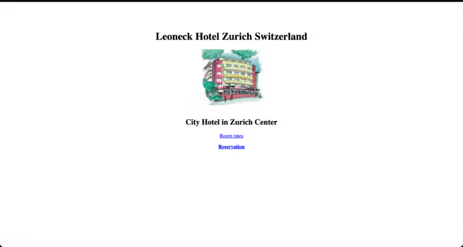
Screenshot from Wayback Machine taken 03/14/2012. Accessed 08/27/2021.
23. Scroll for specifics
The Leoneck Hotel website now is nearly perfect. The home page is the Leoneck logo, a banner-sized picture of the building’s beautiful exterior, and large links to book dates. Those are the exact three items that a hotel guest would likely want to see when they open the page.
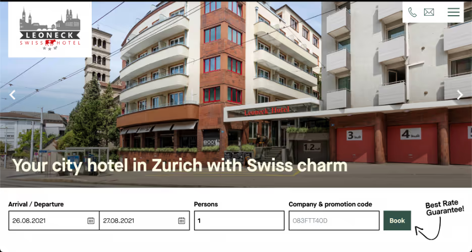
Screenshot taken 08/27/2021.
Again using basic tenets of information architecture and visual hierarchy, the site scrolls down to more specific amenities and features. Eventually, the page leads the user down to the most basic details about the company: directions, ways to contact the hotel, and all the boilerplate business information.
22. Less is always more
The 2014 homepage for the University of Advancing Technology demonstrated two fundamental concepts in web design, the first being: just because you can, does not mean you should. As technology advances and web hosting services offer increasingly intricate options for site design, it can be tempting to put the most unique, most visually rich items into your site. It is understandable to assume that they could help you stand out. Still, there is most definitely a limit.
Using a visualization of the idea of creative thinking, the site’s homepage offered a menu of graphic buttons floating around a student’s head.
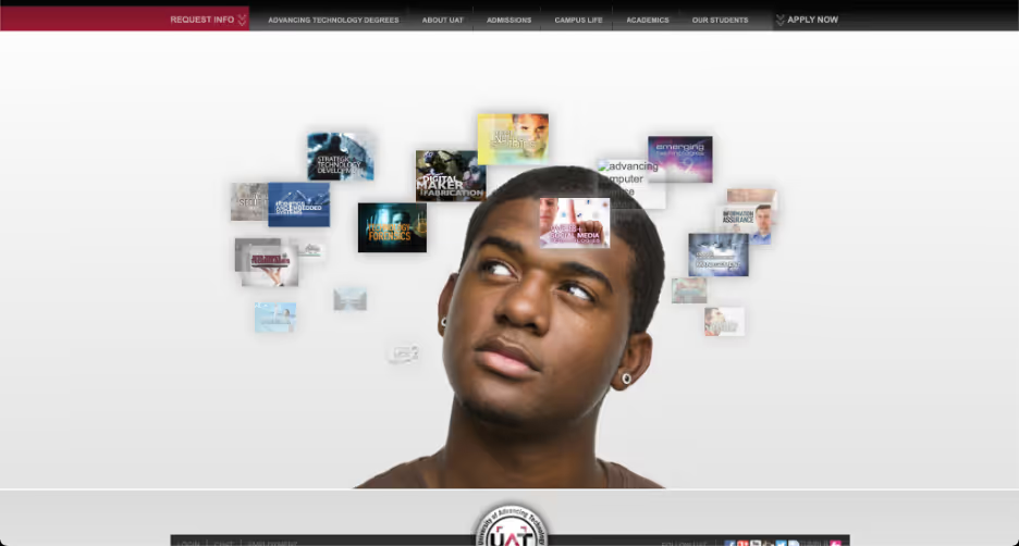
Screenshot from Wayback Machine taken 02/07/2014. Accessed 08/27/2021.
Though on-brand and certainly clever, the menu was unordered and hard to navigate. Instead of sub-pages listed in a logical order, they floated around each other in a cloud. Meanwhile, we are taught to read from top-down and think from general to specific — good user interfaces should keep that in mind.
21. Keep your content moving
The second web design concept that the 2014 University of Advancing Technology site demonstrated was: don’t make them wait. Again, the ‘cloud of ideas’ menu is visually nifty, but the ideas had to rotate to display all of its sub-page buttons. This forced the user to hunt out their desired button and wait for it to come back around to the clickable foreground.
There are very few instances where keeping a user waiting is a good idea. Imagine two different sites with the same content and layout, but one required a five-second pause before clicking any link. When given a choice, it’s likely that 100% of users would choose the pause-free site.
20. Leave the animation to Pixar
The current version of the University of Advancing Technology site has shed its spinning icons. Instead, it is built around a side-scrolling menu that allows access to any sub-page without delay.
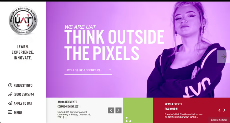
Screenshot taken 08/27/2021.
There is still a certain kitschiness to the layout and its semi-parallax display, but it now feels more like a theme and less like a chore.
19. Update your site as you grow
A different type of small business website is the personal website of a freelancer and/or creative. A great example of a personal website with poor design is the 2010 site of writer Suzanne Collins, best known as the author of the Hunger Games franchise. By 2010, Collins had two Hunger Games novels released, both critical and commercial hits.
Yet, her site looked like the personal blog of a teenager that had been abandoned. It seemed an incomplete effort between its plain white background, uniformly default text, and unaligned pictures.
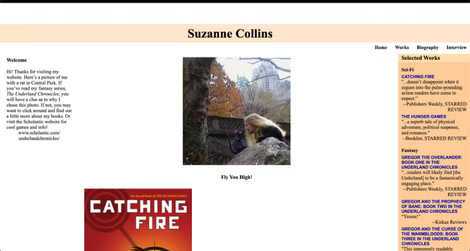
Screenshot from Wayback Machine taken 04/17/2010. Accessed 08/27/2021.
Freelancers have to use their site to market themselves, and Collins’s sparse, incongruent 2010 site would make it a harder sell.
18. Flow and font contrast
The author, Suzanne Collins, has since updated her website, and it now ties itself together well. It’s interesting to see how well the plain white background works, now framed by pastel peach and green. The plain text is nicely contrasted with sans-serif headers, and all pictures and text are confined to three neat columns.
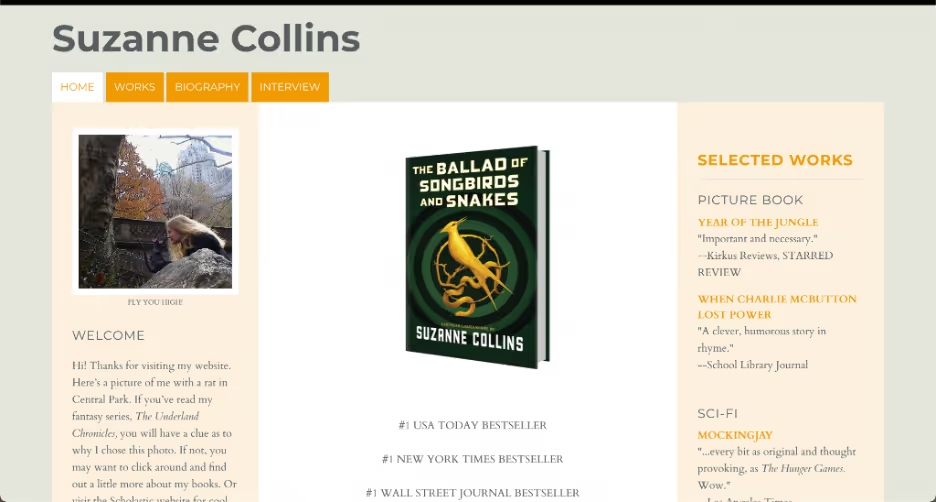
Screenshot taken 08/27/2021.
The changes are minor in terms of the user interface, functionality, color, and layout, but they affect a major change in how cohesive, complete, and polished the page — and in turn, the author herself — seems.
17. Keep brand-defining elements
The minor changes to the Suzanne Collins site, which greatly impacted its presentation, bring up another great point: keep something important to your vision or brand. Just make it work within the broader context of the site.
Collins’s old unfinished site had little aside from a clear love of the color orange and a picture of Collins with a rat — a reference to one of her novels. Whereas those things seemed unconnected and added little before, they now work splendidly together.
The orange has been made a tasteful peach with accents of saturated true orange, and the rat picture remains, now neatly framed within a column that also features a link to the novel it references.
16. Function over funny
As before, when it comes to the “less is more” rule, it’s vital to remember that you can stick to your vision too much and take it too far. Such was the case with the 2009 website of Mr. Bottles, a niche service that offers appraisals and restoration of antique bottles. The industry is a relatively small group of passionate collectors with unique interests, and so it makes sense that the Mr. Bottles website itself is quirky.
There is, however, such a thing as too quirky. As important as your brand is, it needs to be balanced with ease and utility, whether it is built around charm or humor.
The 2009 site was built from fonts of every color, floating icons that trailed you on the page, and a cluttered assemblage of pictures with a background too opaque to easily read the text above it.
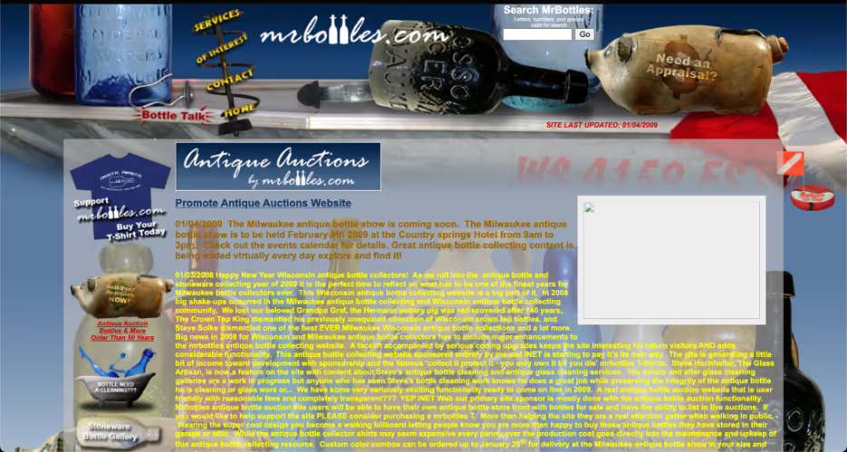
Screenshot from Wayback Machine taken 03/13/2009. Accessed 08/27/2021.
15. Highlight the tone
Mr. Bottles updated their website, completely redesigning it and making it smooth and simple. Though the wall of the text remains (after all, it is a site for enthusiasts), the text is now large enough to read and simply white against a black background.
The floating icons and mismatched graphics are replaced with a simple text menu and an elegant central logo. The pictures of bottles remain, of course, but are now organized in a row on a wooden shelf background, arranged with deliberate and pleasing asymmetry.

Screenshot taken 08/27/2021.
The layout genuinely looks like an actual display by a loving collector, as it fits the site.
14. Edit, edit, edit
In their redesign, Mr. Bottles illustrated a significant nuance: in deciding what part of your humor and charm to keep and what to pare down, it’s crucial to identify your core concepts (i.e., what is it that is truly necessary to your design and image, and what is actually more of a hindrance than a help).
Mr. Bottles tossed the colors, the animations, and the clip art and replaced them with what really matters: antique bottles. The bottles are center stage and arranged lovingly. They show what matters to the site’s owners and their clientele: not quirkiness for its own sake, but the love of the collection.
13. Accessibility is everything
The 2010 website of marketing agency Adlucent illustrates one of the most basic yet critical concepts: contrast. Too many pages used fonts and backgrounds with too little difference in color and brightness. Visitors have to be able to read the text on the site page, period.
There are guidelines for making accessible web pages, meaning pages that the differently-abled can use efficiently — and Adlucent initially failed them soundly in the contrast category. Put plainly: mint green on top of mint green is illegible for many people and difficult to read for the rest.
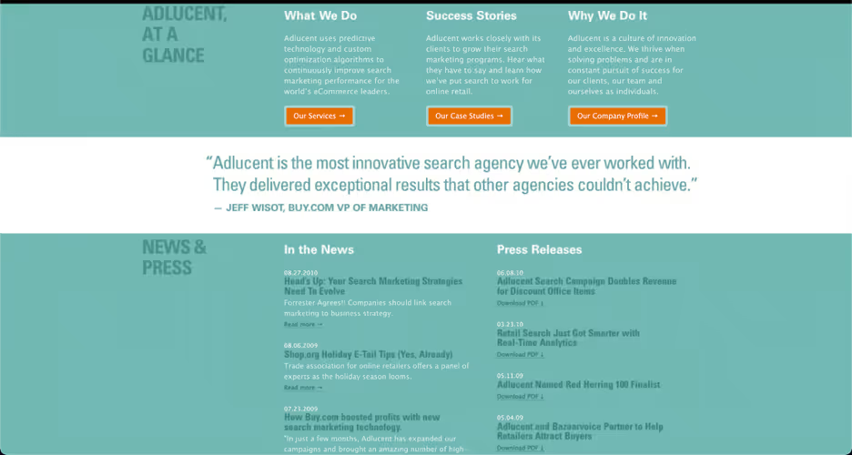
Screenshot from Wayback Machine taken 11/27/2010. Accessed 08/27/2021.
12. Increase readability
Adlucent’s current site fixes the problem. Text and backgrounds are varied in color, brightness, size, and style, but all contrast well enough to be legible. The three core colors — white, black, and lilac — all contrast each other well, regardless of which is on top of which.
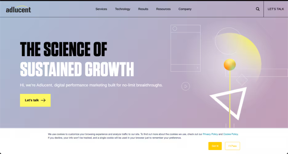
Screenshot taken 08/27/2021.
Further suggesting that Adlucent was aware of the old problem, the new site features almost exclusively oversized text, with even body paragraph text being perhaps two points above the norm.
11. Create visual blank space with purpose
For an Ivy League University, Brown University had a horribly unintelligent website in 2006. For one, the site failed to understand visual hierarchy, placing the entirety of their sub-page links in one visually dense, inexplicably right-aligned cluster of small, white text.
For another, the site failed to consider appropriate resolution and perspective, placing the entirety of the home page in the center third of the page. It gives the impression of claustrophobia, not academia.
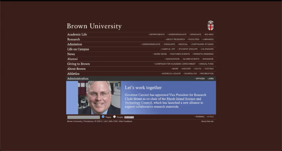
Screenshot from Wayback Machine taken 10/17/2006. Accessed 08/27/2021.
10. Evenly distribute content
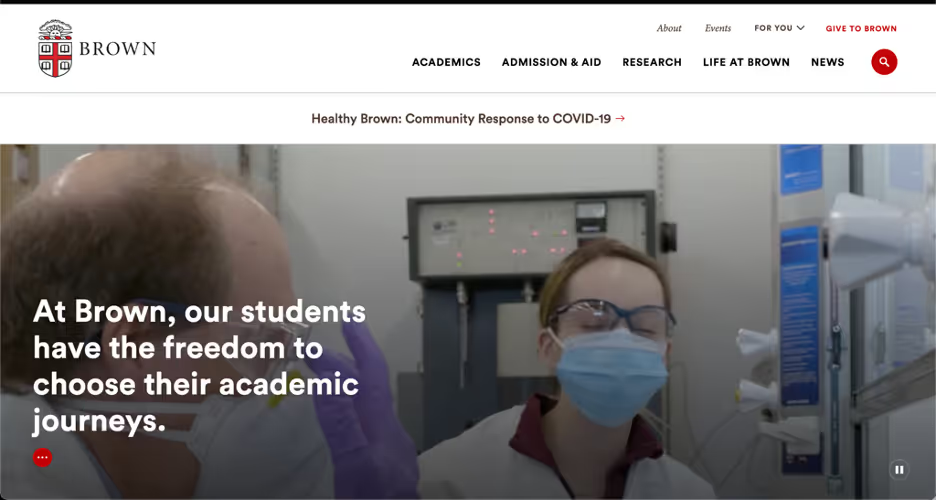
Brown’s current website is straightforward and stately, as one would expect. Upon landing, visitors see the Brown name and logo, a banner video of student life on a green campus, and just five links in a row, all spaced, bolded, and contrasted enough to be obvious and distinct. Scrolling down, visitors are met with links one at a time, each of them distinct from the others by layout or accompanying material.
9. Save the tiles for your bathroom
Headhunter Hairstyling, a small Florida-based salon, can teach a short but valuable lesson about web design: don’t use tiled backgrounds. In 2013, their site background was a picture of a white sand beach with clear blue waters.
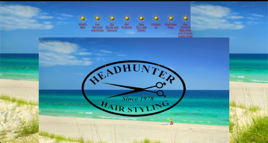
Screenshot from Wayback Machine taken 07/03/2013. Accessed 08/27/2021.
What could have been a beautiful photo and good impression were marred by the fact that the photo was too small and repeated in tiles, again and again. Half of the tiles were cut off, and oddly enough, one center tile was superimposed over the rest, further cutting off each tile. It looked archaic and sloppy.
8. Minimal and muted
The new Headhunter Hairstyling website is minimal, built on cool earth tones and simple shapes; the greens and tans arranged as triangles and squares make for a calming effect, much like the one you might expect from a salon.
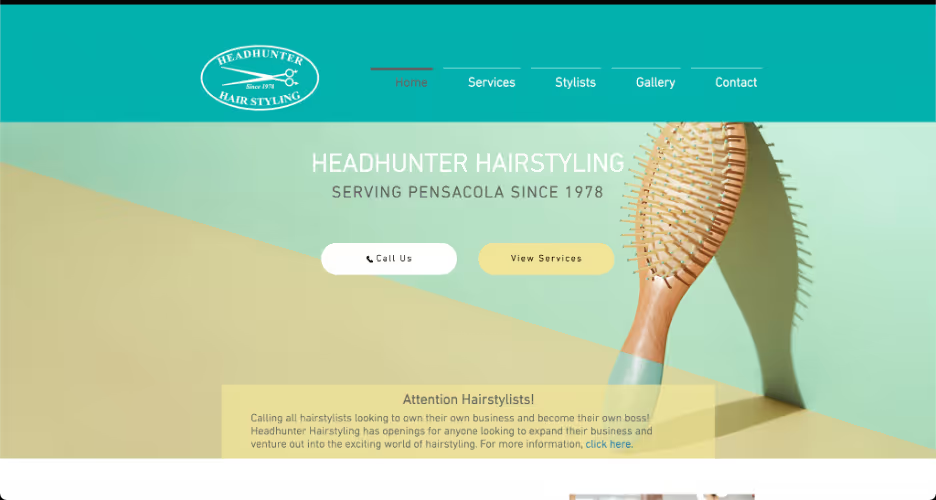
Screenshot taken 08/27/2021.
It features a nice parallax effect around a picture of the salon, and every image is supported by framing and accompanying text — not a tile in sight.
7. Be self-aware
MSY Technology is an Australian electronics retailer whose 2013 site demonstrates how important self-awareness is to site design. If your site presents a theme in one place, don’t reject the theme elsewhere. Likewise, if your site claims something about your company, don’t refute it elsewhere.
The MSY site had no less than six badges on its sides, naming it a top 10 website by Hitwise, an Experian Marketing Services metric of site traffic and market share. While that does not necessarily mean that the site was deemed well-designed, the two metrics seemed inevitably conflicted.
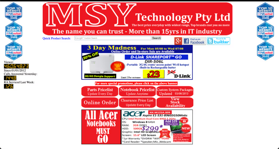
Screenshot from Wayback Machine taken 08/05/2013. Accessed 08/27/2021.
For example, if you boast six times about your ‘best’ website, a viewer might then be more prone to notice your overly saturated, harsh red font and mashed-together, eye-assaulting advertisements.
6. Evolve to stay relevant
The current MSY site is pretty slick. It visually orders itself from the top down, showing name and logo, then locations and services, followed by specific sales. Importantly, they’ve also evolved their harsh red fonts and icons into subtle pastel reds that are easy on the eyes when viewed against the pleasing palette of slate grays.
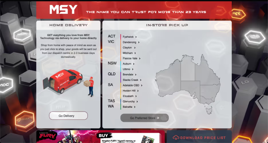
Screenshot taken 08/27/2021.
5. Don't play product hide and seek
There is a concept in web design known as mystery meat navigation, wherein links are hidden to the user unless they hover their cursor over the correct spot. In the early days of the internet, it was a somewhat understandable way to hide those ugly blue, underlined hyperlinks. Since then, however, it has become more annoying than useful.
One egregious offender of the mystery meat style was L.A. Eyeworks, who for years maintained a website with a landing page centered around a cryptic picture and a hidden link.
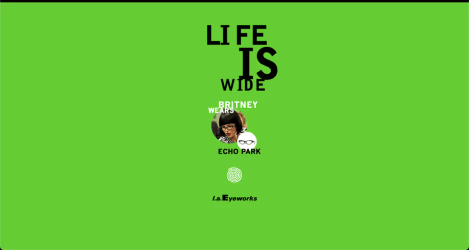
Screenshot from Wayback Machine taken 02/13/2009. Accessed 08/27/2021.
The picture and text were rotated often but always featured a picture of some unknown person wearing glasses and a phrase like, “Britney Wears Echo Park.” Visitors had to click blindly and trust that they would reach a selection of frames and/or services.
4. Consistent design creates familiarity
Just as we said, site visitors don’t want to be kept waiting; they also don’t want to hunt for their goal or stumble blindly around a website. Luckily, L.A. Eyeworks eventually retooled their site for 2015. The new landing page features a collage of famous icons adorned with stylish glasses and a clear catchphrase. It is finally obvious that Eyeworks sells glasses and frames.
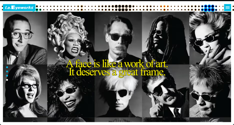
Screenshot from Wayback Machine taken 02/16/2015. Accessed 08/27/2021.
The new site also has a menu that contains clear links to all the necessities: frame styles, store locations, contact info, and the rest. The lingering error is that the menu is still hidden — in this case, tucked away into a small list icon in the top right corner. However, this is a pretty common design choice, as it makes landing pages neater and more minimal but hides desired sub-pages from visitors.
3. Easy menu access
Finally, L.A. Eyeworks has gotten its site just right. The landing page is a banner photo of a man in stylish frames and a pair of eye-catching Eyeworks logos. Though the menu is still hidden by default, any movement of the mouse triggers a giant left-aligned menu to dominate the page.
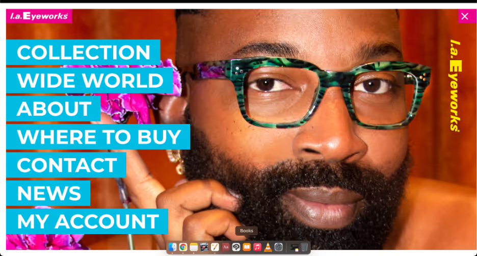
Screenshot taken 08/27/2021.
The mouse hover effect is an effective way to split the difference between the clean artistry of a banner-only homepage and an obvious, useful menu. The visitor is still greeted with the raw, uncovered photo but gains access to the menu in just a moment.
2. Outdated technology makes you outdated
In 2011, the website for Carol House Furniture was guilty of nearly every offense listed here, along with a few new ones. Its landing page featured tiny, light gray text against a white background, making it almost illegible. The white background covered so much of the page that it seemed unfinished. Worst of all was that the landing page did nothing; it had very little information and no working links aside from an enter button that led to an eyesore.
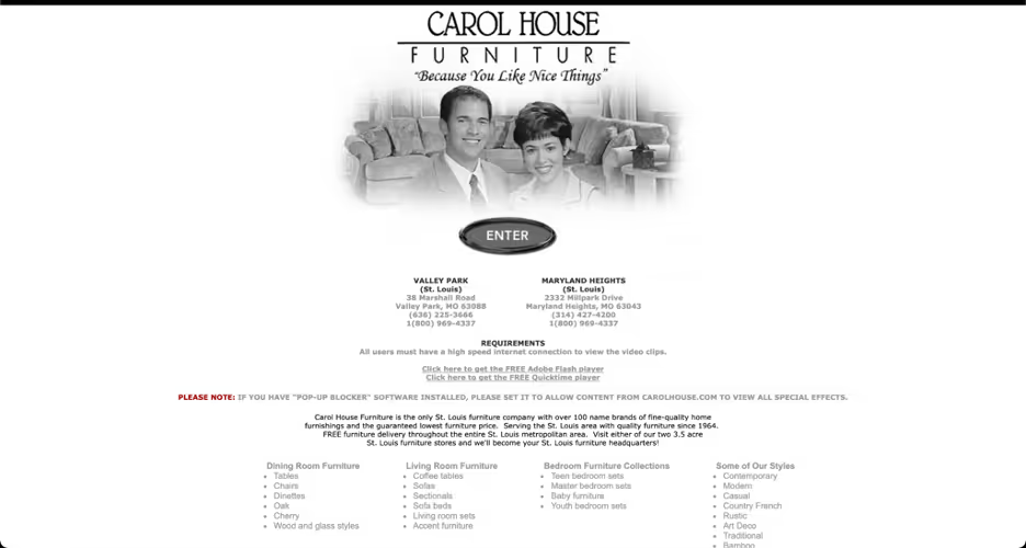
Screenshot from Wayback Machine taken 12/31/2011. Accessed 08/27/2021.
The button launched a pop-up window that covered the entire screen with one big Flash animation. Meanwhile, the animation featured two crackled, poorly mixed voices telling you about the store, though to be honest, I could not tell you who they are; the audio was so loud and low quality that I shut the window (really the Flash emulator because that technology is so outdated) almost immediately.
1. Your site should "just work"
At Carol House Furniture’s current website, the outdated Flash page gimmick, awful sound, and lack of contrast are gone. What was formerly a useless landing page linked to a pop-up is now a direct home page with a straightforward, minimal design.
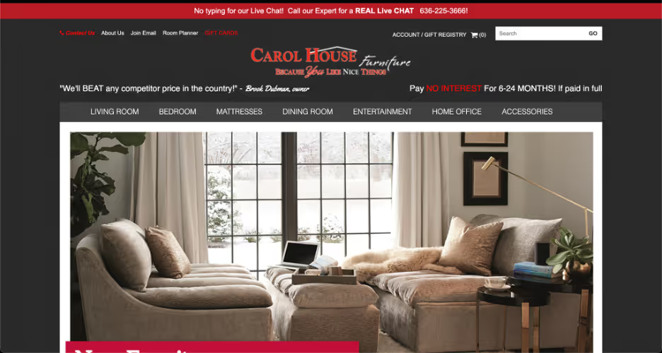
Screenshot taken 08/27/2021.
Information about furniture brands, styles, and prices is now just a hovering mouse and a click away through a simple, white-on-gray menu. There is very little to say about the basic design, which in this case, is a good thing. Sometimes the best site is one that doesn’t inspire any challenge or praise — it just works.
Take your website to the next level with Smith.ai
By now, you can see that dozens of mistakes can make a website ugly, unintuitive, and damaging to your brand. The good news is that for every design problem, there’s a solution. These website makeovers prove that understanding and applying the basic principles of web design and always keeping your user in mind can make any site attractive, accessible, useful, and impactful.
Your site development shouldn’t stop at visuals and navigation, however. If you want to fully engage your customers, consider implementing an interactive customer service experience on your website with the help of Smith.ai. No matter what type of business you run, our team can help you capture and convert quality leads with our virtual receptionist and web chat services.
While you focus on creating and providing the best possible products and services, our team can offer efficient administrative support by:
● Answering phone calls and website chats from prospective clients
● Screening leads so you can save your time and energy for paying customers
● Handling intake and scheduling appointments
Smith.ai offers complimentary consultations and free trials
To explore our services and find out more about how Smith.ai can support your business, take advantage of our free, 30-minute consultation. We also offer a 30-day money-back guarantee. Chat with us live, 24/7, right here on the site or call us at (650) 727-6484 to get started.
Take the faster path to growth. Get Smith.ai today.
Key Areas to Explore

Your submission has been received!
.avif)


