9 Easy Tricks to Improve Your Website Design

In a modern digital world, where everything happens online and change comes every second, your website has become a more powerful means to success than ever. As a non-stop salesman, your website can be your most valuable weapon and the main focus of your marketing activities.
On the other hand, rapidly shifting digital trends can make your website appear old-fashioned. One of the best website interfaces is the kind that doesn't require a set of instructions to follow, and it's friendly to use. Moreover, a complete site makeover may be ideal in some cases as you don't always have the time or money to commit to such a major project. To guide you through overcoming this obstacle, we've compiled a list of 9 easy tricks you can apply to your website to make it more efficient and useful for your visitors.
1. Simplify navigation
Using menu bars is one of the best web design suggestions for improving your site's navigation. Create a button that customers can use to return to your homepage, as well as an explanatory footer. The menu line should run horizontally across the top of every page, but don't crowd it with too many options.
It's advisable to place your company's logo at the top of each page. The logo should be clickable and, as we've already mentioned, lead back to the main page so that leads can simply return there regardless of where they wind up. If you don't have a logo yet, use a logo maker to get one easy and fast.
2. Use bullet points
Bullet points allow leads to promptly absorb all the details they seek: perks, solutions to their problems, and main characteristics of a product/service – all in a matter of minutes. This will make your offers more appealing and allow your lead to obtain all of the information they require. Furthermore, you do not have to stick to the usual approach of a single circle.
With so many trendy icons available, you can be artistic with your bullets and help the reader even more by including graphics that reflect your message. That's important because it lets you focus on the most crucial issues without getting entangled in terminology or technicalities.
3. Include infographics
Clustering your website material into short and simple-to-create infographics can make your webpage both helpful and appealing. A captivating infographic or a dynamic chart keeps a lead on your website while communicating the same facts as a few paragraphs that could have pushed them away.
The infographic below is an excellent illustration of how to convey a lot of data without depending too heavily on words. The visuals and text are blended in a compact manner to provide viewers with helpful information about graphic design.

4. Clean up your website to make it load faster
We've all been frustrated by a website that did not load quickly enough. Sometimes, people leave after only a few seconds of waiting. Your website should load in three seconds or less. Otherwise, you may lose important customers.
You can improve your load time by optimizing image size, uninstalling plugins you don't use, or changing the web host. If you are using live chat software, make sure it doesn’t irritate leads every now and then. Also, your code can be "downplayed" by deleting all irrelevant characters.
5. Scrolling is better than clicking
How to display information if you don't arrange them via sliders and/or accordions? The solution is to put everything on one single page, including the stuff that is usually hidden from view.
Crazy Egg has an interesting case study to prove this concept. They changed their basic, short sales page with the one that was 20x longer. As a consequence, conversions increased by 30%!
Leads appear to enjoy scrolling far more than they do clicking. So, if you're currently dispersing information about your product across multiple pages, it's time to reevaluate.
6. Refine your call-to-action buttons
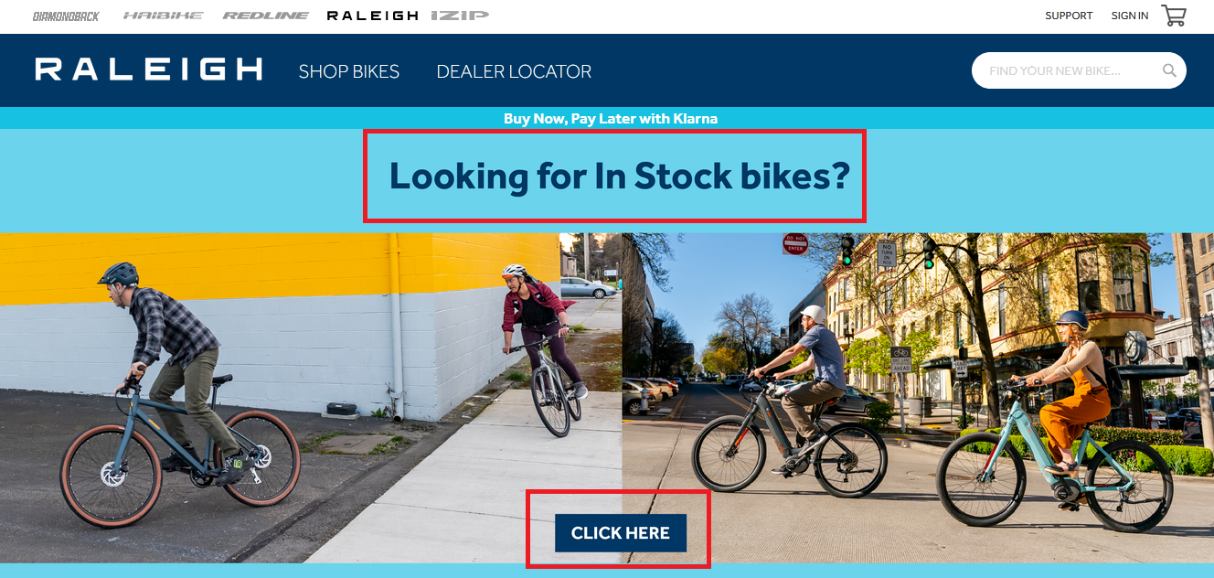
Give as much information as you can with your CTA, so people are left without wondering what to do and where to click. You can inform your visitors what to expect when they open your ad. A clear message will also deter the unqualified leads from proceeding.
Use keywords that evoke feeling or excitement, provide your audience with a reason why they should do the required step, and leverage FOMO (fear of missing out). When people believe they are about to miss out on a once-in-a-lifetime chance, they will be quick to react.

7. Be diverse
People who visit your website come from a wide range of cultures, demographics, professions, and ages. Being a good web designer requires providing a welcome customer experience for all. When selecting imagery and character depictions, ensure that they portray people from various spheres.
8. Animations are a hit!
Animations, like other visuals, can be a great touch to your website. There are several types, including loading animation (which exists just to irritate us all), hover, scrolling, background, etc. It takes some effort to create animations that seem attractive, but when done correctly, your leads and website will applaud you. If you want to take it one step further, consider adding an explainer video to your website. Videos are known to have higher engagement rates, reducing bounce rates, and increasing organic traffic.
Use animation to enrich your website, not to overwhelm it. Don't modify every single element of the structure. Instead of being able to experience the spectacle, it will mislead your guests from the crucial point that you were trying to express.
9. Work out the color scheme
Red, green, and yellow color palettes are more effective for CTA buttons because they are connected with positive feelings such as enthusiasm, tranquillity, and joy. People are more likely to purchase or subscribe when they are calm and pleased. Allow your leads to feel these emotions when on your website.
Another thing you can do is optimize your collection of font sizes, shades, and colors. The easiest way to improve your hierarchy is to place the most significant material on the left half of the first two blocks on your main page. It's known as the F-pattern, and it comes naturally to people because most of us read online pages from top to bottom and left to right.

Summary
Web design is a sophisticated subject that has a significant impact on the success of your business. Because of that, it's critical to understand what you're doing. Using research to guide you is an excellent approach to ensure this.
Investing some time to study and apply these pointers on your website leads to drastic changes that could significantly boost your website's performance, experience, and conversions.
Related Posts


.svg)
